Fabric Concepts
Let's make a FINN page
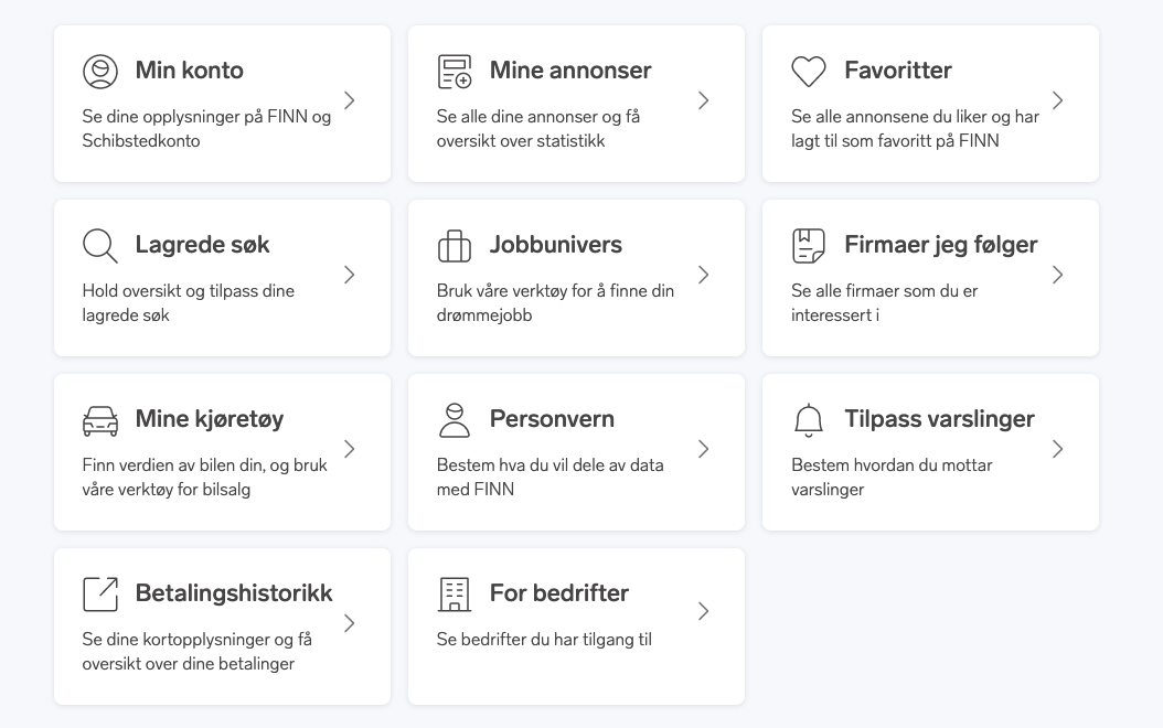
So let's pretend we get a task to create a FINN page, we will use the Min FINN page as an example.
Screenshot, minfinn on smaller screen

Screenshot, minfinn

As we can see the main layout follows the same pattern as most pages on finn.
We will dig a little deeper into the main menu part of it.
1. Getting setup
If not already done, there is a compehensive setup-guide to get up and running.
2. Header/Footer
The top-bar and Footer are standard FINN components (exists as podlets). We will ignore these for now. FINN Header podlet on github FINN Footer podlet on github
3. Page-container
The purpose of this is to keep the page aligned correctly across the site, making it scale correctly on different window sizes/devices, and also keep it nice and tidy inside the outer banners.
The sketch shows a background going full width outside the page-container, so we need to wrap it inside something that holds the background-color.
<div class="bg-blue-100">
  <div class="page-container">...</div>
</div>
4. Grid
Thinking mobile first we just need standard div (display:block) behavior to get the 1 col layout we need on smaller
devices.
<div>...</div>
We add a grid to help us with the layout. The grid can start at the medium (md:) breakpoint and up from there giving us multiple columns only when we need them.
<div class="md:grid">...</div>
Adding 2 columns from medium breakpoint, and 3 columns from large and up.
<div class="md:grid md:grid-cols-2 lg:grid-cols3">...</div>
5. Card content
Screenshot, card content on smaller screens
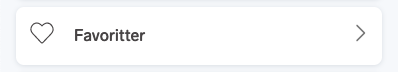
Screenshot, card content on larger screens
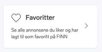
Looking at the layout for each card we would need a little bit of markup to start with, something like:
<div>
  <div>
    <svg></svg>
    <a href="#">Title</a>
  </div>
  <p>text-content</p>
</div>
We will afterwards wrap this content in a card component, but let's look at the content first. The svg tag is just a placeholder of course. For actual implementation details of svgs with Fabric, look at stage 8 in this guide.
Starting with the title, this should prob be the main linked item for the card.
Screen readers do not like it if we wrap a whole card of content like this inside, neither a button or an A tag, the screenreader would treat all the content as one very long sentence with no other structure.
The card component uses a trick where the A element (its required to have either an A element or a Button element
to make a card component clickable) interactive area is stretched to the size of the full clickable card, so this is
perfect for this use-case:
We vertically center the icon and the title with flex.
<div>
  <div class="flex items-center">
    <svg></svg>
    <a href="#">Title</a>
  </div>
  <p>text-content</p>
</div>
Dependent on the final page markup structure we probably want to wrap this title in an appropriate H tag. The H tags
should be used in a semantic way, forming a clear tree structure not skipping any levels. The sizes and look of them can
be set using the t1-t5 class.
<div>
  <div class="flex items-center">
    <svg></svg>
    <h3>
      <a href="#" class="ml-16">Title</a>
    </h3>
  </div>
  <p class="pt-8">text-content</p>
</div>
The text-content bit is supposed to be hidden on mobile. Since the responsive setup in Fabric is mobile first, we need
to hide it for smaller devices and then un-hide it for bigger ones. This is easy using classes hidden and md:block.
One thing to consider is if this hidden content should be available for screen-readers, even when hidden visually.
<div>
  <div class="flex items-center">
    <svg></svg>
    <h3>
      <a href="#" class="ml-16">Min konto</a>
    </h3>
  </div>
  <p class="pt-8 mr-8 hidden md:block">Se dine opplysninger på FINN og Schibstedkonto</p>
</div>
The friendly UX person is now annoyed because we forgot the arrow to the right on the card, but that is no problem, we just wrap around another flex container.
<div class="flex items-center">
  <div>
    <div class="flex items-center">
      <svg></svg>
      <h3>
        <a href="#" class="ml-16">Min konto</a>
      </h3>
    </div>
    <p class="pt-8 mr-8 hidden md:block">Se dine opplysninger på FINN og Schibstedkonto</p>
  </div>
  <div class="ml-auto">
    <svg></svg>
  </div>
</div>
Card Content example on Tailwind.play
6. Adding cards
Fabric includes component libraries for React, Vue and custom elements. In these libraries you can find a card component
that suits your app. In this example, we'll use the f-card component from the custom elements library to add a custom
HTML element that we use to make cards with.
Let's implement the custom element version of the card component.
First we import the Fabric custom elements library in a JavaScript file somewhere in our application as shown:
import '@fabric-ds/elements';
After this we can use the f-card element in our markup like so.
<f-card>
  <div aria-owns="title"></div>
  <div class="flex items-center">
    <div>
      <div class="flex items-center">
        <svg></svg>
        <h3 id="title">
          <a href="#" class="ml-16">Min konto</a>
        </h3>
      </div>
      <p class="pt-8 mr-8 hidden md:block">Se dine opplysninger på FINN og Schibstedkonto</p>
    </div>
    <div class="ml-auto">
      <svg>...</svg>
    </div>
  </div>
</f-card>
You can find out more about the f-card custom element in the
Element card docs.
If you are writing your application using React, you'll want to take a look at the React Card component. Likewise, if you are using Vue, you can see the Vue Card docs for more information.
7. Serving SVG's
Fabric comes with its own Icon library All the icons are generated in the icons section, so lets find our icons there. The icon for min conto looks like the 'circle-user' icon under 32.
If you are building a React application, you can import and use the Fabric icons React components like this:
import { IconCog16 } from '@fabric-ds/icons/react';

<IconCog16></IconCog16>
And if you are building a Vue application, you can import and use the Fabric icons Vue components like so:
import { IconCog16 } from '@fabric-ds/icons/vue';

<IconCog16></IconCog16>